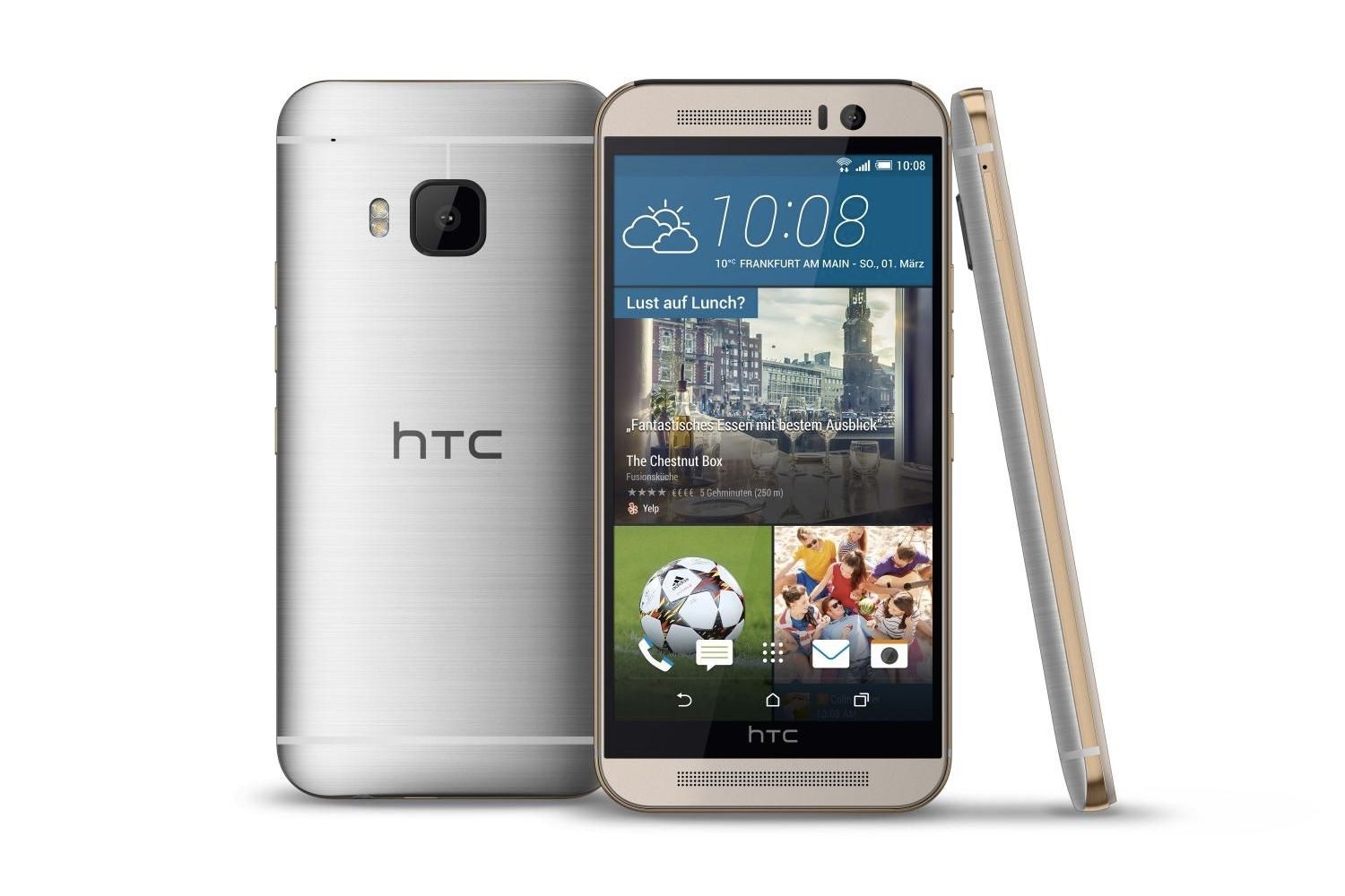
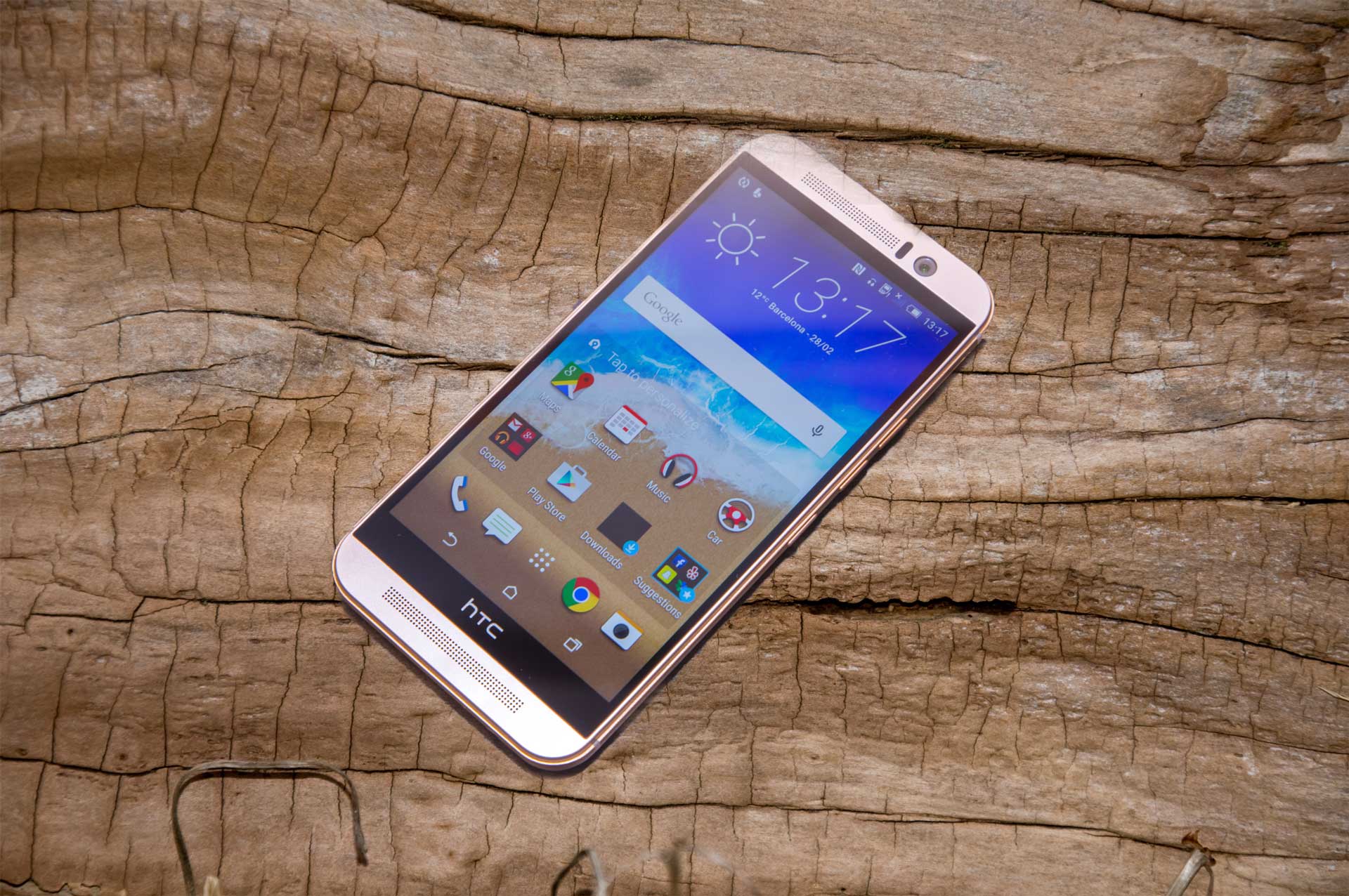
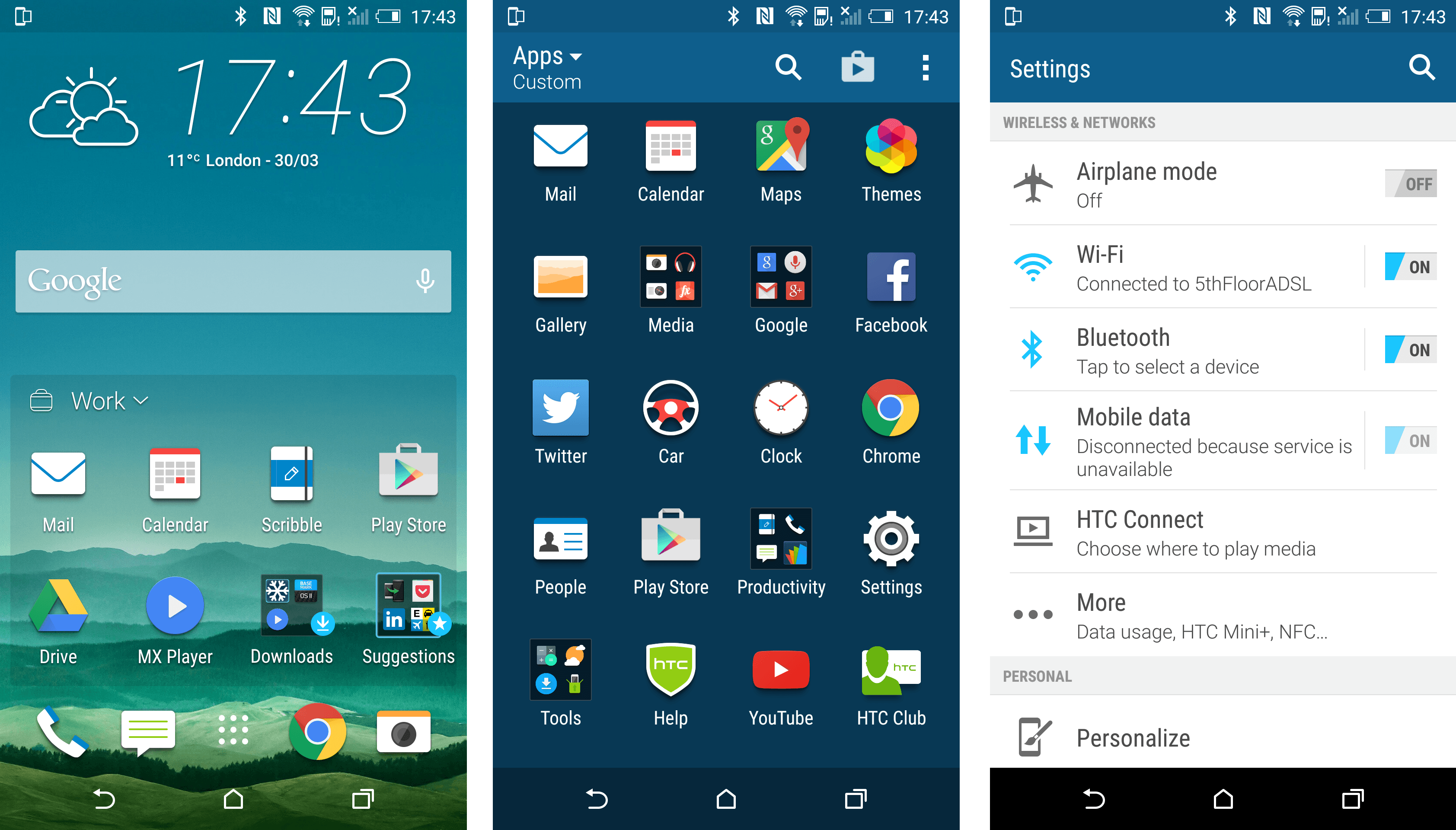
The Sense is HTC’s adapted version of the Android home screen and compared to the main competitors stands out above the rest. It has been refined and tweak to produce a powerful and quick UI that just works.
It does have the issue of being a bit click heavy when trying to do certain actions other phones would do faster. These can be things such as creating new home pages, folders or rearranging apps. All these functions are buried within other menus that were hard to find in the first week of playing with the phone. Being compared to other phones the UI is quick but does take some time to learn which could be off putting for people familiar with a simpler interface.
What works, does work well and that is the general use of the software. Each tap or swipe is very alert, everything is smooth and quick but does get bogged down sometimes when you are multi-tasking between many different apps. This could be thanks to the Snapdragon 810 chip which packs a decent punch but is being throttled at times. Testing out the overall quickness between the iPhone 6 and Note 5 the HTC One M9 did feel just a little bit less responsive but was not something that you would notice unless you had the others to hand.
Signal on the phone is impressive (based on O2), not in many places would I have no connection at all, which could not be said for other phones I have tried. Considering the phone is all metal, somehow HTC has managed to create a way of getting the signal through the phone on an impressive level. This meant that calls were of great clarity and quality, something easily noticed over other phones.
Notifications
The lock screen features notifications are handy for quick glances of updates to information. They can be swiped away if you don’t want them or tapped to bring up the app in question which is nice. HTC have also worked with Google to make sure cards on Google Now show up as notifications also embedding the Google app directly into the main home software.
In the pull down menu, you will be able to see all notifications. A second pull down will also bring up your quick bar that allows access to WiFi, Bluetooth and other settings that you could use regularly without having to root around in the main settings. The pull down can get quite busy but a simple press on the X will remove all current notifications which can be a quick cleanse of too much information.
Tied together, it makes a useful notification system which you can use however suits your needs. The integration of the Google cards is great if you have set it up and if you don’t want to be bombarded you can change how notifications are displayed on individual apps, including turning them off.
Sense Home
Sense Home is an interesting integration into the M9 and something which you will either love or hate. It is a live section of the home screen which shows you the apps you use most in different situations and can be tied to locations.
Broken down between Home, Work and Out it uses the GPS and other tricks to clearly show you the apps you use in those situations. It works well being able to give you the apps you are most likely to use say at work like Facebook or at Home such as your Kindle App. You can also manually add apps to the Sense Home and create folders within it that further expand the customisation to match exactly how you want your best apps to be displayed. This was great in the morning, on the train with Sense Home changing with easier access to the newspaper app and Twitter.
Personally, it was a great addition to the M9 being able to select the news app easily on the way to work but not having to worry about the Facebook and social media icons at home were great. It’s worth mentioning that the system is automated, so be careful what you use the most as it could end up front and centre.
Keyboard
A big let down on the M9 is the keyboard. I just did not get along with it at all, the accuracy of the buttons did not seem to be great. More often than not I found myself pressing the wrong key as the spacing between them in minimal.
Word prediction is also off, most of the time the next word you wanted to use was incorrect and when you started to use your own language it would pick up the wrong words or ones you previously misspelled.
My first action to M9 owners would be to download a different keyboard. As with my previous phone the Google Keyboard is a good replacement and something that I am still using with the M9.
Performance

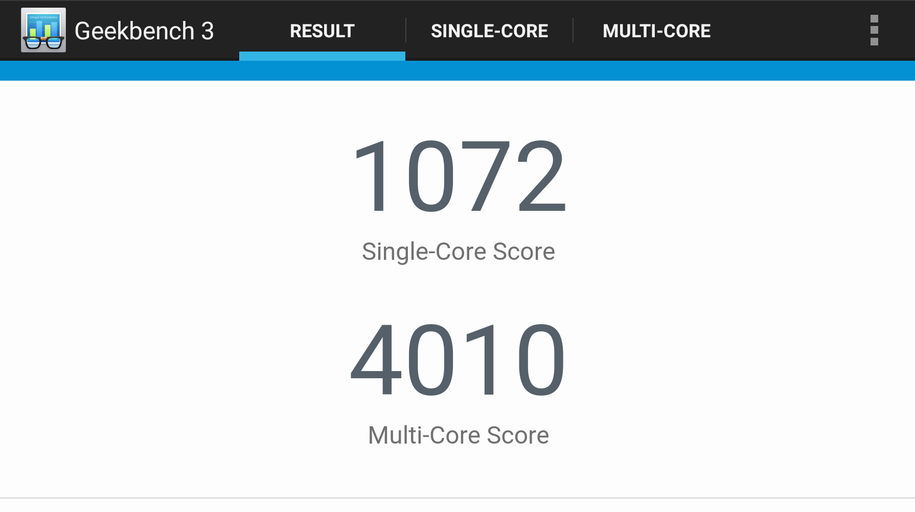
Like with a lot of high end phones, the HTC One M9 is a powerful phone. Testing the phones using GeekBench 3 the scores were high with impressive scores as you can see in the screenshot above. As mentioned previously, the M9 has been throttled to reduce the heat coming from the components, so it is not a true all purpose score but all phones have similar limits or you’d be holding some hot metal.
Even with the power limits the HTC One is still a great phone to use for gaming and trying it with the Fallout Shelter and March of Empires it was definitely faster to load and nicer to play compared to my previous phone.
Themes
One of the small parts of the phone with a big impact is the themes. You can really customise how you want the phone to look by changing the colours of the menus and each variation of the colour scheme. Want a bright pink system? You got it. What might seem as a small part of the phone really gives you the option to make it your own and include the background options you have your own little home in a phone.
