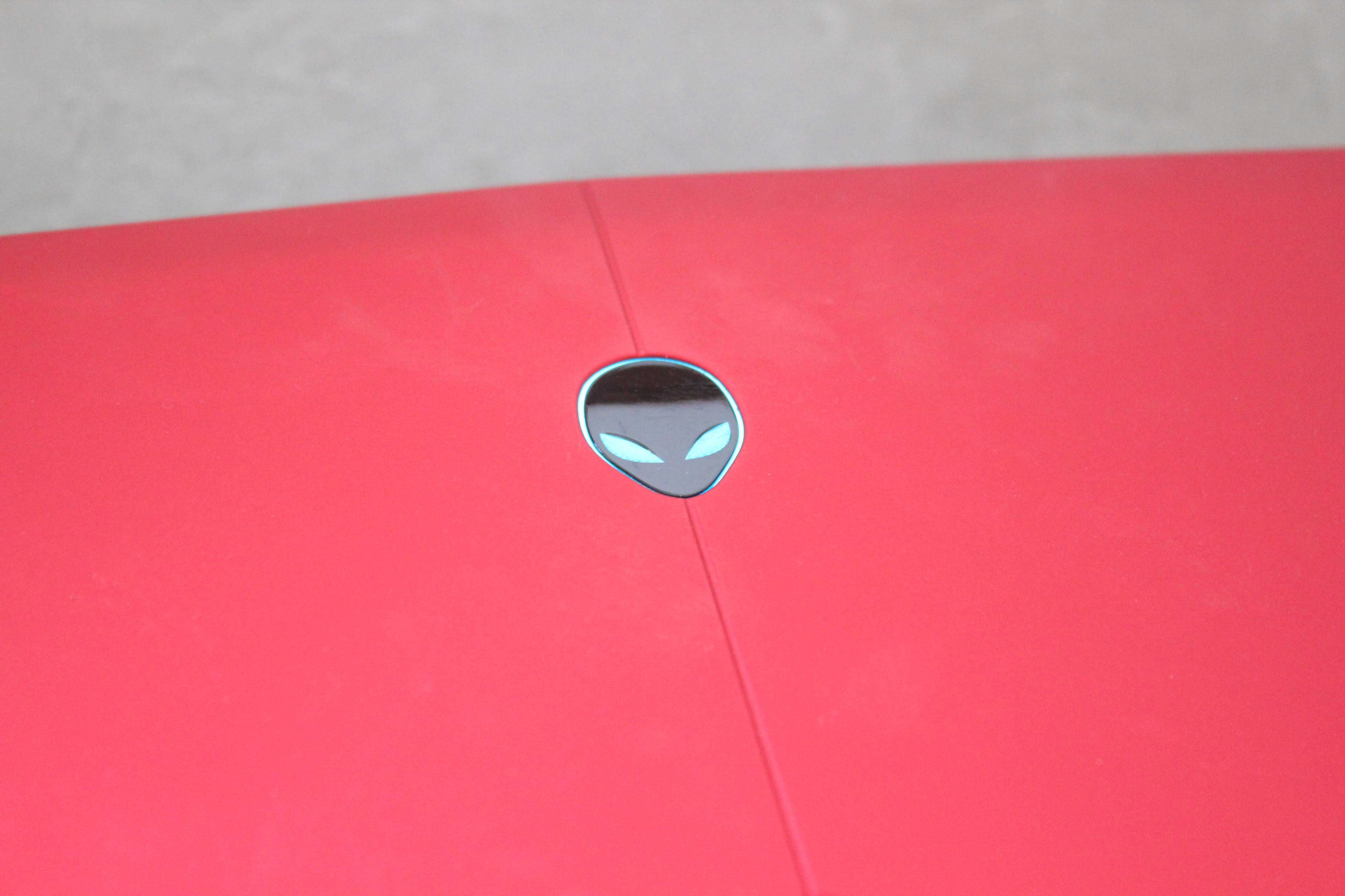
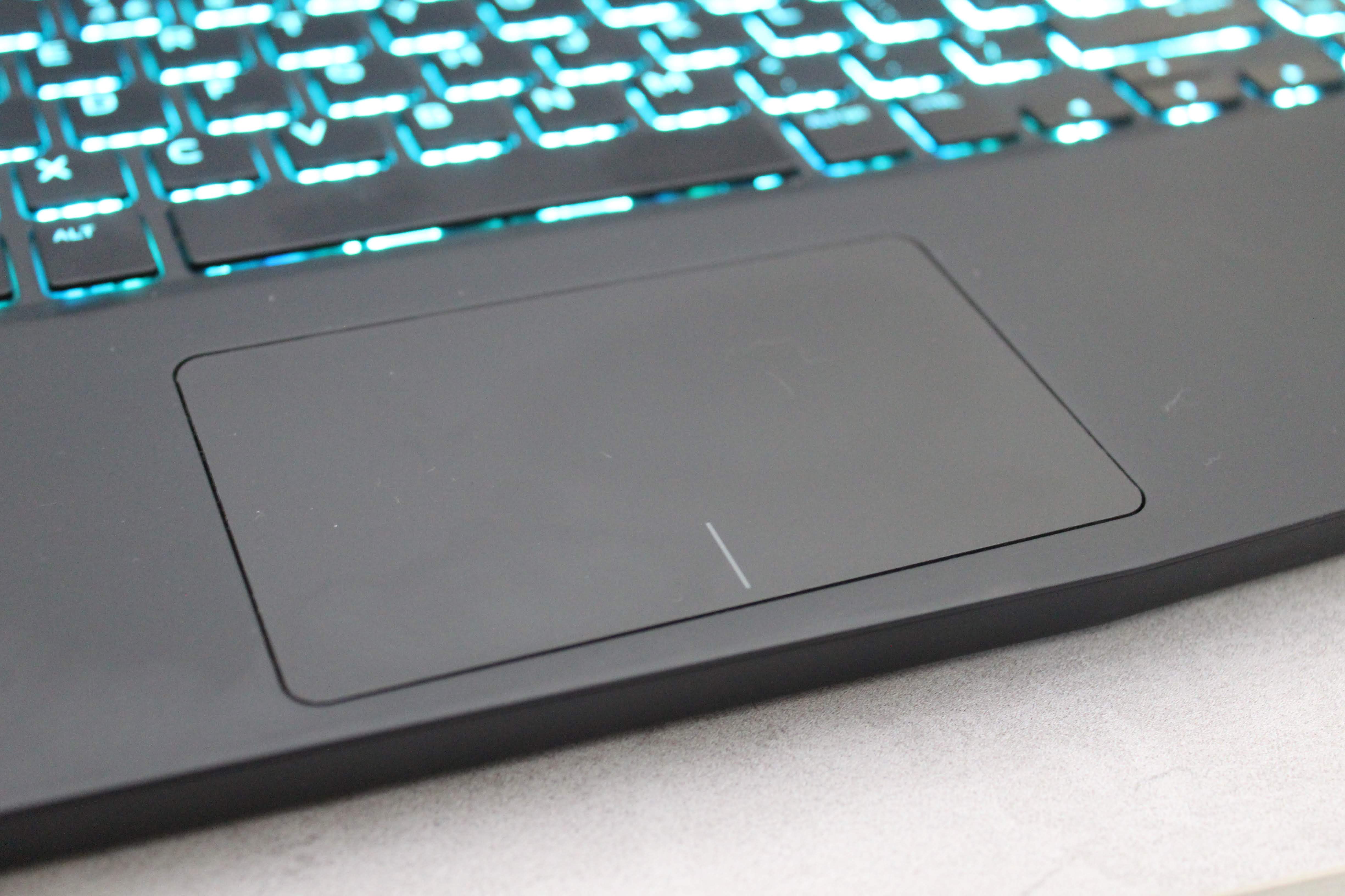
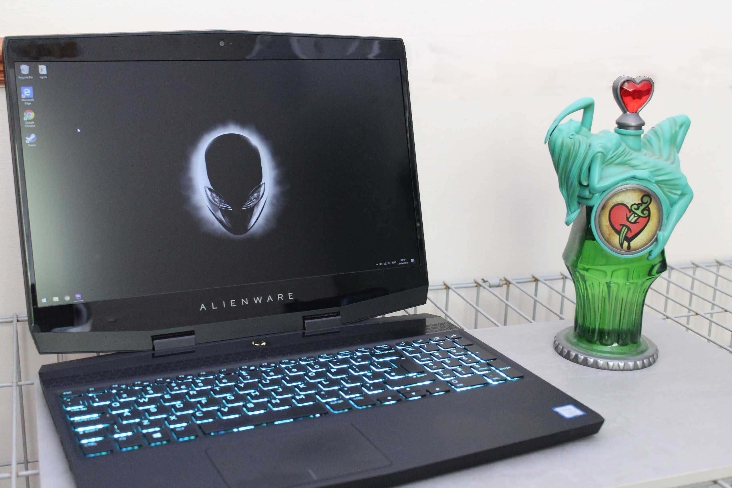
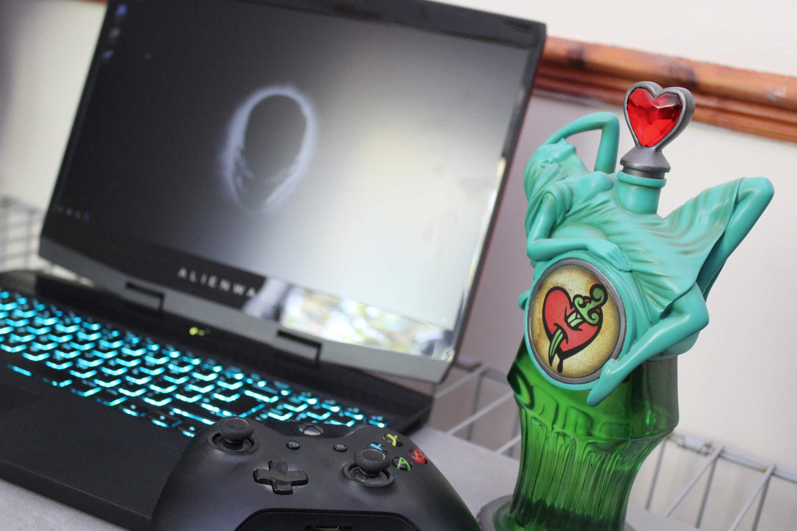
One thing that Alienware never falters at is good design materials and a look which stands out while also not being what I like to call “gamer-y”. The chassis is made from almost completely magnesium alloy which is able to give the M15 it’s lighter weight plus making it tougher.
Even though it is over 20% lighter than the previous models weighing in at 2.16kg it’s still not hitting those MacBook levels of lightness but forgivable as it’s designed for a completely different purpose. When reviewing the m15, people would come to take a look at the striking red design and how much thinner it looked. One of the main comments that stuck, however, was after picking it up most said that “it’s so much lighter than it looks” clearly giving brownie points to the fact that looks heavy but really is not.
Now looking back at the colour scheme the Nebula Red as Alienware calls it, is absolutely beautiful. It stands out among a lot of other laptops in the building and catches the eyes of anyone who walks past. Sadly it does like to catch fingerprints and get a little dirtier a bit quicker than some others but a welcomed tradeoff to have something that is that nice to look at.
On the inside is an all matte black interior paired with the standard Alienware blue lighting. The bezel really is the only major letdown of the overall design as it surrounds the display and makes it look a lot bulkier than the rest of it. The top and sides are not too bad but at the bottom where the logo sits has a big space that makes it feel a bit old. Looking at it logically, the screen matches the size of the base to make it fit (where all the bigger components are) when closed and the screen stays in the correct ratio fo the 15-inch display, so making the screen a non-standard size height wise probably would have looked a lot weirder. Finally on the bezel, like the lower part of the laptop, they should have stuck with a matte finish instead of the gloss as it is a bit too reflective when looking at the screen.

Most of the ports for the M15 are on the back which is a smart move to keep all the cables out of the way when using it. At the back, you’ll find the power port, HDMI port, mini DP and a USB-C port with Thunderbolt 3. On the left side are the ethernet connection and a single USB port with the headphone jack. On the right are two more USB connections so you should have enough for most gaming needs.
One connection left out that is also on the back is Alienware’s proprietary eGPU port that allows you to connect their Alienware Graphics Amplifier which is a fancy term for the external graphics card holder to give you even more power by using a regular desktop card. As Thunderbolt is able to use any of the graphics amps on the marker, you are not tied to Alienware’s but if you want to keep the same look going you can also pick the Alienware Graphics Amplifier up for £154.
The speakers are the one thing that threw me off, as they are located at the base of the main unit’s body by the touchpad on either side. This makes the M15 sound a lot louder as they are closer to the user but you’d expect when opening it up for them to sit at the top under the screen. This grid at the top is actually for the cooling meaning it’s able to span the entire laptop giving more space for heat dissipation.


